
Layout
Containers do the placing. You say how things flow and how they size; Facet does the arithmetic.
{
  "name": "Session",
  "font": "Inter 15/22",
  "width": 340,
  "padding": 20,
  "gap": 16,
  "fill": "#FFFFFF",
  "cornerRadius": 16,
  "column": [
    {
      "row": [
        {"text": "Riyaz session", "font": "17/22 700"},
        {"space": "fill"},
        {"text": "40 min", "color": "#6F6879"}
      ],
      "width": "fill",
      "align": "center"
    },
    {
      "row": [
        {
          "each": ["Sa", "Re", "Ga", "Ma", "Pa", "Dha", "Ni"],
          "do": {
            "row": [{"text": "{.}", "font": "13/16 600"}],
            "padding": [6, 10],
            "cornerRadius": 8,
            "fill": "#F3EFF7"
          }
        }
      ],
      "gap": 6,
      "wrap": true,
      "width": "fill"
    },
    {
      "row": [
        {"text": "Skip"},
        {
          "row": [{"text": "Start", "color": "#FFFFFF", "font": "15/20 700"}],
          "padding": [10, 20],
          "cornerRadius": 12,
          "fill": "#1A1423"
        }
      ],
      "gap": 16,
      "justify": "end",
      "align": "center",
      "width": "fill"
    }
  ]
}
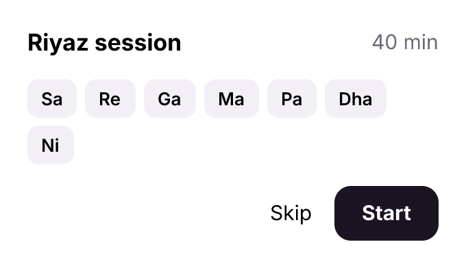
Three rows in a column. The first pushes 40 min right with a space that fills; the second wraps its chips, made with each; the third ends at the right with justify.
Flow keys
| Key | Forms | What it does |
|---|---|---|
gap | number, [row, column], {"row", "column"}, "auto" | space between children (a grid's between rows, then columns); "auto" spreads them. Negative in a row or column that does not wrap: each child lies over the one before by that much, later ones on top, and a frame that hugs is as long as what they cover (four avatars of 40 with "gap": -8 are 136 wide). A row that wraps and a grid keep 0 or more |
padding | number, [v, h], [top, right, bottom, left] | room inside the edge; a negative side is set to 0 with a note, and the frame keeps its auto layout |
align | start, center, end, stretch, baseline | across the flow (a grid's cells down their row); stretch is CSS's: a frame that hugs takes the line's size, the tallest child setting it (a fixed child keeps its size, a text keeps its lines, a text in a column wraps at its width, a shape spans the line); baseline is CSS's too, in a row: the first lines of its texts sit on one baseline (a title and the count beside it, a price and its unit), a frame's baseline is that of what it starts with, and a child without text sits on the line by its bottom edge. In a column or grid it places children at the start |
justify | start, center, end, space-between, space-around, space-evenly | along the flow (needs room). space-between puts the first and last child at the edges; space-evenly makes every space equal, the two ends included; space-around gives the ends half a space |
wrap | true | a row breaks into lines |
columns | number or tracks | a grid's columns; a text given no width, as a cell or in a cell's column, wraps at the cell's width when it would run past it (a note names it), and keeps hugging its words when it fits |
columnSpan, rowSpan | number | a grid child covers that many columns, or rows: a card with "rowSpan": 2 stands beside two rows of the cells after it, and both rows together are as tall as it is. A file with a row span needs Facet 0.3.212 or later to open |
gridRows | tracks or "none" | a grid's rows, top to bottom, written as columns are: a height, a share "1fr" of the height left (at least the row's content, as CSS's 1fr) or "hug"; rows past the list hug. Beside a card with "rowSpan": 2, "gridRows": ["1fr", "hug"] gives the first row what the card leaves and keeps the second as tall as what it holds. "none" removes them. A file with grid rows needs Facet 0.3.217 or later to open |
Sizes
width and height take a number, "fill" (the room the parent's flow leaves) or "hug" (the content; the default for containers). size is both at once: a number, or [width, height]. A percentage is read on the children of a row (width) or a column (height): shares that add up to 100% ("30%" and "70%") share the room left after the gaps, as grow weights do, and other shares are taken of the parent's room inside its padding when its size there is a number. Anywhere else a percentage is not a size, and the build says so. minWidth, maxWidth, minHeight and maxHeight bound any of them. A child that hugs along a row keeps the width of what it holds however little room the row has, unless it says a minWidth: then it gives way when the row runs out of room, down to that width, as a CSS flex item does ("minWidth": 0 on a chip that clips its label lets the row squeeze it; one with no minWidth overflows). A column's children keep their height. A container that hugs stops at its max, and a child that fills it then gets the room the max allows: a row with "maxWidth": 320 and a text with "width": "fill" is 320 wide and the text wraps inside it. A text given no width wraps there too, in the room the max leaves it, and a short one keeps the row hugging: a chat bubble is {"row": [{"text": "…"}], "maxWidth": 260, "padding": [8, 12]}. "maxWidth" on a text itself does the same: longer words wrap at it, shorter ones keep their width.
A child that fills across a parent that hugs that way takes the parent's size and never gives it: a clipped pattern with "height": "fill" in a row is as tall as the row's other children, however tall its content. To make cards in a row one height, the tallest setting it, use "align": "stretch" on the row instead.
A text with "width": "fill" wraps at the width its row or column gives it and takes the height of its lines; when the parent resizes, the text measures its lines again. "maxLines": 1 keeps it to one line with an ellipsis.
Space
A child that fills across with a maxWidth (or maxHeight) and an alignSelf fills up to its maximum and is then placed by its alignment, as CSS centres width: 100%; max-width: 736px; margin: 0 auto: {"width": "fill", "maxWidth": 736, "alignSelf": "center"} in a 1200 wide column is 736 wide at 232.
"grow": 1 on a child takes the room its row or column leaves, as "fill" along the flow does. A number shares that room by weight, as CSS's flex-grow does: in a 300 wide row, "grow": 1 and "grow": 2 come out 100 and 200 wide, so a stacked bar is its values as weights. modify changes a weight, source writes it back, and a --sync whose source fills without one puts it back to 1. A file with a weight needs Facet 0.3.147 or later to open.
"margin" on a child of a row, column or grid is room of its own around it, beyond the parent's gap: "margin": 8 on every side, [vertical, horizontal], [top, right, bottom, left], or sides by name ({"top": 8}). Along the flow it moves the child and what follows it; across the flow it insets the child, and a child that fills takes the width its side margins leave. A side may be negative: {"margin": {"top": -4}} stands a caption 4 px nearer the title than the gap, and {"margin": {"left": -12}} lays one avatar over the one before it. A frame that hugs is as large as its children with their margins; a negative margin across the flow moves the child out past the frame's edge. {"space": 12} is still a spacer between two children (it stands between two gaps), and a negative space takes that much room back. modify changes a margin, source writes it back in its shortest form, and a --sync whose source no longer writes one takes it away. A file with a margin needs Facet 0.3.181 or later to open.
"alignSelf" on a child of a row or column puts it across the flow where it says, whatever the parent's align is: "start", "center", "end", "stretch" or, in a row, "baseline" ("auto" follows the parent again). One item at the bottom of a row whose items sit at the top is {"alignSelf": "end"}. source writes it back and a --sync whose source no longer writes it lets it go. A file with a row or child aligned by baseline needs Facet 0.3.191 or later to open.
"inset" on a child of a row, column or grid takes it out of the flow and pins it that far in from its container's edges, as in a stack: "inset": 0 is a background behind the other children or an overlay over them (children are drawn in the order written), [top, right, bottom, left] pins each side, and a side that is null is left free, so [0, null, 0, 0] is a bar down the left edge as tall as the container. The pin is part of the layout, not a position worked out once: when the container grows or shrinks (a longer text, a --sync, a larger instance of a component whose main holds the pinned layer) the pinned child follows its edges, and a container that hugs is never sized by it. source writes it back as inset, modify changes it, and the inspector shows it under the layer's sizing. A file with a pinned child in a flow needs Facet 0.3.191 or later to open.
"dividers" on a row or column draws a rule between each pair of its children, never after the last: "dividers": "@line" (a colour), true (the kit's line colour), or {"color": "@line", "weight": 1, "inset": 12} to keep it clear of both ends. In a column the rules lie across its width; in a row they stand its height. "between" puts any node there instead: {"row": ["Home", "Docs", "API"], "between": "·"}. Both lower to ordinary layers (the rules are named Divider), so each can be selected and restyled, source shows them as children, and a --sync that adds or drops a child adds or drops its rule. A layer placed with at is outside the flow and gets none.
"line" on a row or column draws one rule behind its children, along the flow and as long as the container whatever it holds: a timeline's line through its dots, a stepper's line through its circles. "line": true runs it through the middle of what each child starts with; {"x": 20, "color": "@line", "width": 2} places it (y in a row; "side": "right" pins it to the far edge; "inset": 8 shortens both ends). It is a layer named Line, placed after layout, so it is as long as the container again after every --sync.
Connecting layers
{"connect": ["React", "JSON"]} draws an arrow from the layer named React to the layer named JSON. Write it beside them, as one more child of the row, column or stack that holds both: it takes no room in the flow. The line is routed once everything is laid out, so the boxes stay in rows and columns and nothing is placed by hand:
{
  "row": [
    {"name": "React", "padding": [10, 14], "fill": "@card", "row": ["React"]},
    {"name": "JSON", "padding": [10, 14], "fill": "@card", "row": ["JSON"]},
    {"connect": ["React", "JSON"], "stroke": "@facet", "label": "emits"}
  ],
  "gap": 120
}
| Key | Takes | Default |
|---|---|---|
from, to | the side the line leaves and enters by: left, right, top, bottom, center | the sides facing each other |
curve | smooth, straight, elbow (right angles) | smooth |
arrow | end, start, both, none | end |
stroke, weight, dash | as a draw shape: a color (a kit color stays bound), a width, [dash, gap] | the color texts take here, 1.5 |
gap | clear space between a box and the line's end | 4 |
label | a text beside the line's middle, clear of it (above a line that runs across, to the right of one that runs down, off a slanted one square to it), or any other node (a chip with a fill) centered on it | none |
route | avoid: around the layers beside it that it does not join; direct: the line curve draws, through whatever is in the way | avoid |
The result is an ordinary drawing named React → JSON (give it a name to choose another): select it, restyle it, delete it. A --sync after the boxes move routes it again and keeps its layer. A name no layer has is reported (NOT_APPLIED) and nothing is drawn. Moving a box in the app does not move its connectors; build or sync again.
{"space": 12} is a fixed gap in a row or column; {"space": "fill"} takes the free room, so whatever follows is pushed to the end.
Lines that leave or enter one box by the same side are spread along that side, in the order of what they reach, so two arrows never start from one point or cross on the way out.
Around what is in the way. Among other layers (cards in a map, steps in a flow) a connector is routed around the ones it does not join, as orthogonal connector routing does it: the path with the fewest turns for its length through the gaps between them, at least 8 px from each, each middle stretch centred in the gap it runs through, crossing and running along the lines already drawn beside it as little as it can, and set 6 px apart from one where they share a gap. Every line among other layers is routed this way, so a map's lines all run alike; smooth rounds their turns, elbow keeps them square. A background that holds other layers (a lane band behind a row of cards) is not in the way, nor is a layer that holds either end. A line with no clear way round is drawn through and says so (CONNECTOR_CROSSES); "route": "direct" draws the plain line. Moving a box in the app routes the lines that follow it the same way.
When a box moves. A connector follows the layers it joins. Drag a box in the app, nudge it, resize it, change a row's gap or a padding in the inspector, edit a text that makes a box grow, or run any command (modify, arrange, build --sync): when the edit lands, the connectors whose ends moved are routed again, with their labels, in that edit's undo step, so one undo puts the box and its arrows back together. During a drag the arrow waits and is routed when you let go. Only connectors whose ends moved are touched, and a design without connectors does no work for them. The relation is kept with the document (which layers a connector joins, by layer, and how it runs), so it survives saving and reopening; a connector whose shapes you redraw by hand is left as you drew it.
Tables: a grid written row by row
A grid's columns can size themselves and place their cells, and a grid can be written a row at a time. Column widths are never worked out by hand:
{
  "name": "Incidents",
  "width": 520,
  "padding": 8,
  "fill": "@paper",
  "cornerRadius": 12,
  "columns": ["hug", "fill", "hug", {"width": "hug", "align": "end"}],
  "gap": {"column": 16, "row": 0},
  "align": "center",
  "header": {
    "cells": ["Id", "What happened", "State", "Runs"],
    "style": "cap",
    "color": "@mute"
  },
  "rows": {"padding": [10, 12], "cornerRadius": 8},
  "dividers": "@line",
  "grid": [
    [
      "INC-7",
      "Checkout total is wrong with a coupon",
      {"chip": "Open"},
      "1,204"
    ],
    {
      "cells": [
        "INC-12",
        "Search returns stale results",
        {"chip": "Fixed"},
        "87"
      ],
      "fill": "@green/6%"
    },
    ["INC-103", "Login loop on Safari", {"chip": "Open"}, "9"]
  ]
}
| Write | For |
|---|---|
"hug" in columns | a column as wide as its widest cell (beside a number, "fill" and "Nfr") |
{"width": "hug", "align": "end"} in columns | the same widths, with the column's cells at its start, center or end: numbers line up on the right |
"grid": [[cells], [cells]] | one list per row. Each row becomes a layer named Row 1, Row 2…, so it can be filled, rounded, given a height, selected and restyled like any layer |
"rows": {...} | what every row is given: padding, fill, cornerRadius, height |
{"cells": [...], "fill": ...} | one row with keys of its own (a highlighted row, a name, a key) |
"header": [cells] or {"cells": [...], "style": "cap"} | a first row named Header. It shares the rows' padding, so its cells sit over theirs, and takes its own keys |
"dividers" | a rule between rows, as in a column |
"gap" | a number for both, or {"column": 16, "row": 0}; unwritten, columns are 12 apart and rows touch |
Without columns, a grid written row by row has as many equal columns as its longest row has cells. A row holds at most one line of cells.
What it builds is ordinary layers: a column of grids that share the columns. In a flat grid ("grid": [cells]) a hugging column is live: it follows its cells when a text is edited in the app. Written row by row, every row is its own grid, so hugging columns are measured once the rows are laid out and each row keeps that width as a number; build --sync measures again.
Stacks
In a stack the children overlap. Each is centered unless it says otherwise with at, and the stack takes the size that covers its children, again after every --sync, unless it has a width or height of its own: its largest child, and as far as a child placed at a point ("at": [3, 2], a drop shadow's offset) reaches. A child with "inset": 0 fills the stack instead, whatever size the others give it: a scrim over a card, an outline around content of any size ("inset": 8, or [top, right, bottom, left], keeps it that far in). It does not size the stack. A stack's padding (a number, [v, h], [t, r, b, l], {"top": …}, each a number or a spacing token such as "@m") insets where its children are placed. Frames, stacks and component templates clip what reaches outside them unless they say "overflow": "visible": a focus ring drawn outside a control needs it.
{
  "name": "Avatar",
  "stack": [
    {
      "type": "ellipse",
      "size": 72,
      "fill": {
        "linear": ["#F29F05", "#D9485F"],
        "angle": 135
      }
    },
    {
      "text": "AK",
      "font": "Inter 24/28 700",
      "color": "#FFFFFF"
    },
    {
      "row": [
        {
          "text": "3",
          "font": "Inter 11/14 700",
          "color": "#FFFFFF"
        }
      ],
      "padding": [2, 6],
      "cornerRadius": 10,
      "fill": "#1A1423",
      "at": ["top right", -2, 2]
    }
  ]
}

An avatar: a gradient circle, initials centered on it, and a badge pinned to the top right corner.
Placing a layer: at
| Form | Places the layer |
|---|---|
[x, y] | with its top left corner at x, y |
[x, y, "center"] | with that point of itself at x, y: any place word, "top center", "bottom left", "right". A text anchored at its center grows up and down as it wraps; anchor it by its top ("top center", "top left") to grow down. A placed text that overlaps another text warns LAYOUT_OCCLUDED. |
"bottom right" | in its parent by words: top, bottom, left, right, center, or two of them |
["bottom right", -16, -16] | by words, then moved by an offset (x to the right, y down, so -16 lifts it) |
{"angle": 90, "r": 80} | its center at that angle (degrees clockwise from the top) and distance from the parent's center |
In a row or column, at takes the layer out of the flow. Places pin the layer with constraints, so it keeps its place when the parent changes size.
Frames in a row: after
A top-level layer without x and y goes right of everything on the page. For a sequence, slides or screens of a flow, "after" places it right of the top-level layer it names, 80 apart, tops aligned: {"name": "Slide 2", "after": "Slide 1"}. In a call that builds several, "after": "previous" follows the node before it in the same call; {"node": "previous", "gap": 120} sets the gap. A component set or the icon library parked to the side never breaks the sequence, and export --pdf takes the frames in reading order, so a deck is built and exported without computing an x. A PDF holds one page of the file (the page showing, or --page NAME); --pages all puts every page of the file in one PDF, page after page in the pages list's order, and --pages Cover,Flows those pages in that order.
Rows of frames. "after": {"node": "previous", "wrap": 4, "gap": [80, 120]} starts a new row after every fourth frame: at the row's left edge, under its tallest frame, the gap's second number apart. The row is read from the page, so a later call that names the last frame continues it. No x = index × step.
A caption above a frame is a column of the label and the frame: {"name": "Checkout · captioned", "gap": 12, "column": [{"cap": "Checkout"}, {"name": "Checkout", ...}]}. The label moves with the frame, the next frame clears both, and "after": "Checkout" still follows it by the frame's name.
Frames already on the page. facet arrange --columns 4 --gap 80,120 lays the page's top-level layers out in rows, in reading order, without touching what is inside them (facet arrange "Slide 3" "Slide 1" places those, in that order; --at X,Y chooses where). Columns are as wide as their widest frame and rows as tall as their tallest, so nothing overlaps after frames change size. It is one undo step.
Rings
A ring places its children around a circle of radius r, the first at start degrees (clockwise from the top), the rest evenly after it. A child may set its own angle. "arrows": true (or a color, or {"color", "weight", "gap"}) draws an arrow from each child to the next, clockwise along the circle, under the children and clear of them (gap: degrees left free on each side of a child), for a cycle diagram. A ring grows to cover its children, and a stack around it takes that size.
{
  "name": "Clock",
  "stack": [
    {
      "type": "ellipse",
      "size": 220,
      "fill": "#F6F1EA",
      "stroke": "#1A142322"
    },
    {
      "ring": [
        {
          "each": 12,
          "do": {
            "text": "{#}",
            "font": "Inter 15/20 600",
            "color": "#1A1423"
          }
        }
      ],
      "r": 88,
      "start": 30
    },
    {
      "type": "ellipse",
      "size": 8,
      "fill": "#D9485F"
    }
  ]
}
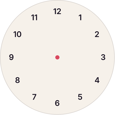
A clock face: twelve numbers from each on a ring starting at 30°, over a circle and a center dot, all in one stack.
Rotation
rotation turns a layer counterclockwise, in degrees, about its own top-left corner: that corner stays where at, x and y put it ("at": [100, 100] turns a 100 × 40 layer by 90 up from (100, 100)). With an anchor, "at": [x, y, "center"] puts the layer's centre at x, y first, so it looks turned about its centre. In a row, column or grid, a rotated layer keeps its own size and the flow makes room for its turned box. A layer turned less than 45° that fills (a tilted card, "width": "fill") takes the room as its own width or height, so its content wraps at that width; its corners stand out a little past the room, on purpose, and no warning counts them.
Skew and matrix
skew slants a layer about its top-left corner, as CSS's skew() does: "skew": -20 leans its verticals 20° (the top to the right), [x, y] slants both ways (each between -89 and 89). With rotation beside it, the layer is turned after the slant. matrix draws a layer through any CSS matrix [a, b, c, d, e, f] (x' = a x + c y + e, y' = b x + d y + f) about its top-left corner, which moves by (e, f): a skew, a scale ([0.5, 0, 0, 0.5, 0, 0]), a mirror ([-1, 0, 0, 1, 140, 0] flips a 140-wide layer in place) or a 3D turn seen flat. It replaces rotation; "matrix": "none" draws the layer upright. The layer keeps its own size, its contents lay out in its own axes and are drawn through it, and in a flow it takes the upright box around what is drawn, as a rotated layer does. inspect and source give the matrix when a layer is more than turned, to four decimals; a matrix that folds a layer flat (a d - b c = 0) is refused.
{
  "name": "Cards",
  "width": 660,
  "height": 140,
  "fill": "#FFFDF8",
  "font": "Inter 16/22 700",
  "color": "#FFFFFF",
  "stack": [
    {
      "name": "Plain",
      "at": [20, 30],
      "width": 130,
      "height": 80,
      "fill": "#D9485F",
      "cornerRadius": 8,
      "padding": 12,
      "column": ["Plain"]
    },
    {
      "name": "Skewed",
      "at": [190, 30],
      "width": 130,
      "height": 80,
      "fill": "#3B6FD9",
      "cornerRadius": 8,
      "padding": 12,
      "skew": -20,
      "column": ["Skewed"]
    },
    {
      "name": "Mirrored",
      "at": [350, 30],
      "width": 130,
      "height": 80,
      "fill": "#2E9E6B",
      "cornerRadius": 8,
      "padding": 12,
      "matrix": [-1, 0, 0, 1, 130, 0],
      "column": ["Mirrored"]
    },
    {
      "name": "Half",
      "at": [510, 30],
      "width": 130,
      "height": 80,
      "fill": "#7A4FD0",
      "cornerRadius": 8,
      "padding": 12,
      "matrix": [0.5, 0, 0, 0.5, 32.5, 20],
      "column": ["Half"]
    }
  ]
}
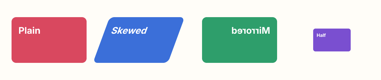
Four cards: plain, skewed by -20°, mirrored in place, and scaled to half, each with its words drawn through it.